Choosing a palette for your kitchen is about more than just picking a pretty paint chip. Color influences your mood, affects the perceived size of the room, and even impacts your home’s resale value. Because the kitchen is a high-traffic area filled with permanent fixtures like cabinets and countertops, your color choices need to be both stylish and sustainable.
Whether you are looking for a bold modern statement or a timeless classic look, these kitchen color scheme ideas will help you find the perfect balance for your home.
The Power of Neutrals: Timeless and Airy
Neutral palettes remain the most popular choice for kitchens, and for good reason. They create a clean, “blank canvas” feel that makes the space look larger and brighter.
Classic All-White
A white kitchen is the epitome of timeless design. It reflects light beautifully and feels incredibly hygienic. To prevent it from looking too clinical, mix different textures such as a subway tile backsplash, marble countertops, and warm wood flooring.
Warm Greige and Cream
If pure white feels too cold, “greige” (a blend of gray and beige) is the perfect alternative. It provides a sophisticated, earthy warmth that pairs beautifully with brass hardware and natural stone.
Bold and Moody: The Rise of Dark Kitchens
In recent years, dark and dramatic kitchens have surged in popularity. These schemes are perfect for homeowners who want to create a cozy, high-end, or “boutique hotel” vibe.
Navy Blue and Gold
Navy blue cabinets paired with gold or brass handles are a modern classic. This combination feels regal yet approachable. It works best in kitchens with plenty of natural light to prevent the space from feeling cramped.
Forest Green and Charcoal
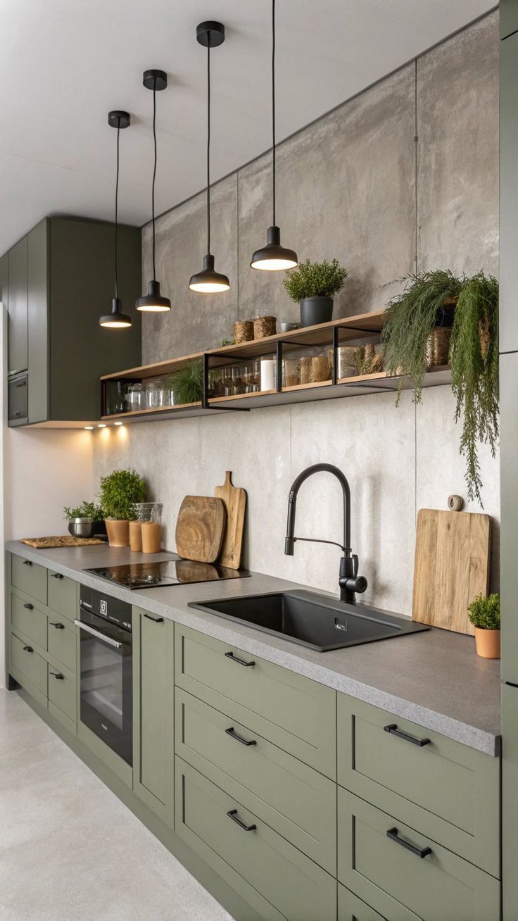
Deep greens bring a sense of nature indoors. When paired with charcoal gray or black accents, forest green creates a grounded, organic aesthetic that looks stunning with butcher block countertops or oak accents.
Two-Tone Cabinets: The Best of Both Worlds
Can’t decide on just one color? The two-tone kitchen is a brilliant design trick. Usually, this involves painting the lower cabinets a darker shade and the upper cabinets a lighter or neutral shade.
- Grounding the Space: Darker lowers “anchor” the room, while light uppers keep the ceiling feeling high and open.
- Adding an Island Pop: Another popular two-tone approach is to keep all wall cabinets neutral but paint the kitchen island in a standout “accent” color like terracotta, dusty teal, or sage green.
Earthy Tones and Terracotta
As we move toward more organic interior design, earthy color schemes are making a major comeback. Think of colors inspired by clay, sand, and stone.
- Terracotta and Sage: This combination offers a Mediterranean feel that is both calming and vibrant.
- Muted Ochre and Wood: A soft, mustard-yellow paired with natural wood grain creates a sunny, “country cottage” atmosphere that feels lived-in and welcoming.
How to Test Your Color Scheme Before Committing
Before you buy gallons of paint, consider the “60-30-10” rule used by designers:
- 60% Primary Color: Usually your cabinets or walls.
- 30% Secondary Color: Your flooring, countertops, or backsplash.
- 10% Accent Color: Your hardware, lighting fixtures, and small decor.
Always observe your color samples at different times of the day. A gray that looks perfect in the morning sun might turn a strange shade of purple under evening LED lights.
Frequently Asked Questions
What kitchen colors make a small kitchen look bigger? Light colors like off-white, light gray, and soft pastels are best. Using a monochromatic scheme (where the walls and cabinets are the same light color) removes visual barriers, making the room feel more expansive.
Are colorful kitchens bad for resale value? Extremely bright or “niche” colors (like hot pink or bright orange) can be risky. However, sophisticated colors like navy blue, sage green, or soft charcoal are currently very popular with buyers and can actually add a premium feel to your home.
How do I match my countertop color to my cabinets? If you have “busy” countertops with lots of veining (like granite), choose a solid, simple cabinet color. If your countertops are a solid, flat color, you can afford to be more adventurous with your cabinet colors or backsplash patterns.
What is the most popular kitchen color in 2026? Sage green and “Warm Earth” tones are the top trends. Homeowners are moving away from stark “cool grays” in favor of colors that feel more organic and cozy.
Does the finish of the paint matter (Matte vs. Glossy)? Yes. High-gloss finishes reflect more light and are easier to wipe down, but they show fingerprints easily. Matte finishes hide imperfections well but can be harder to scrub. “Satin” or “Eggshell” is usually the best middle-ground for kitchens.